
Roku TV — Product Discovery & E-commerce Redesign
I redesigned the Roku TV shopping experience to make it easier for customers to understand the product lineup, compare options, and move from discovery to purchase. The concept was informed by a UX audit, competitive research, and analysis of the existing customer journey, with a focus on clearer information hierarchy, product comparison, and a responsive experience across desktop and mobile.
Project Summary
Role
Product Design, UX/UI
Focus
Product Discovery, Comparison & E-commerce
Methods
UX Audit, Competitive Research, Information Architecture, Prototyping
Platform
Responsive Web
The Business Problem
Roku’s TV lineup had expanded across multiple models, sizes, and feature sets, making it increasingly difficult for customers to understand the differences between products and determine which TV was right for them.
The existing shopping experience presented product information, but there was an opportunity to create a clearer path from discovery to comparison and ultimately purchase.
Strategy & Research
I reviewed the existing Roku TV shopping experience alongside competing consumer electronics and TV brands to understand how customers were being introduced to product differences, features, and purchase options.
The audit highlighted three opportunities: simplify how the TV lineup was presented, make comparison easier earlier in the journey, and create clearer paths between product education and purchase.
Those findings shaped the information architecture and helped prioritize the content and interactions carried into the redesign.
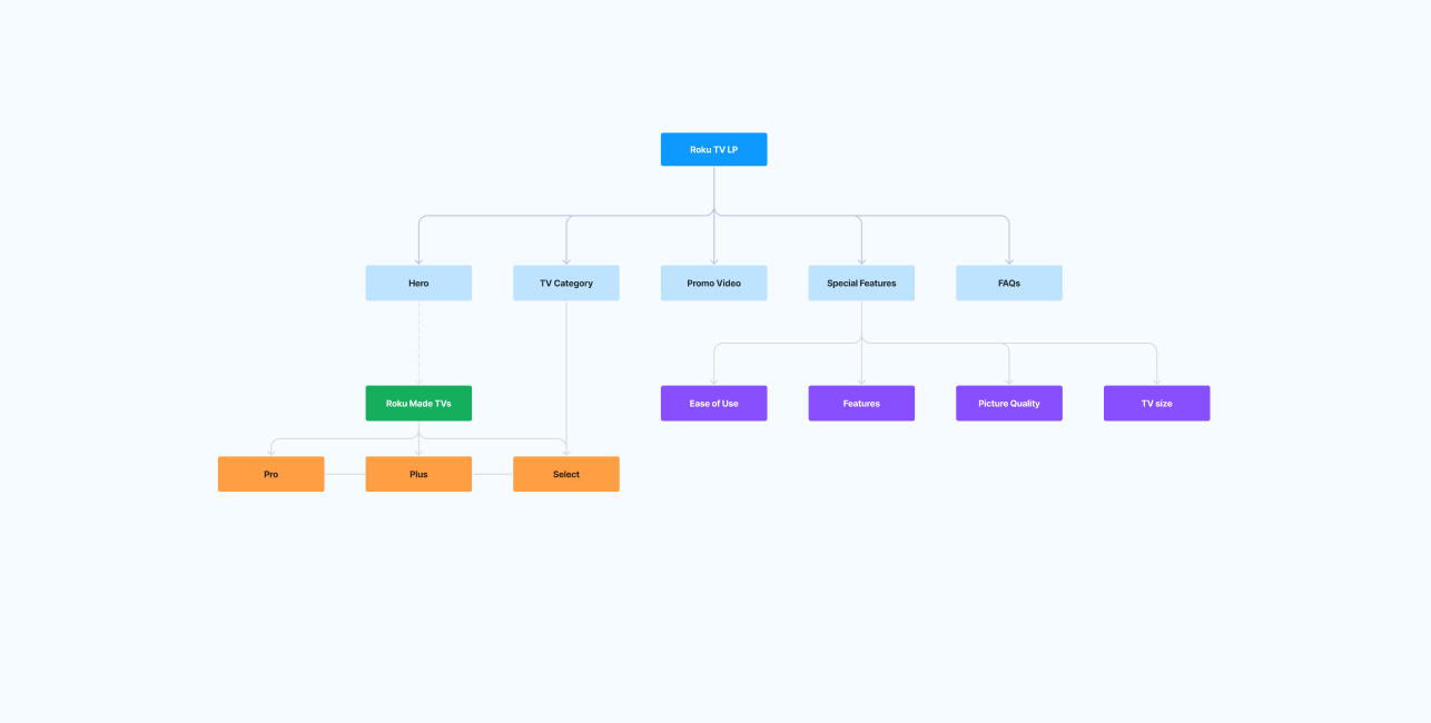
Simplify Discovery
Help customers understand the Roku TV lineup without requiring them to navigate through excessive product information.
Make Comparison Easier
Surface meaningful differences between models and sizes earlier in the shopping journey.
Connect Education to Purchase
Create clearer transitions from learning about Roku TV features to evaluating products and taking the next step toward purchase.
Before
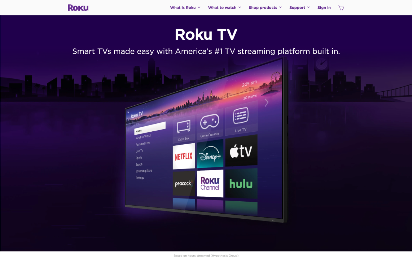
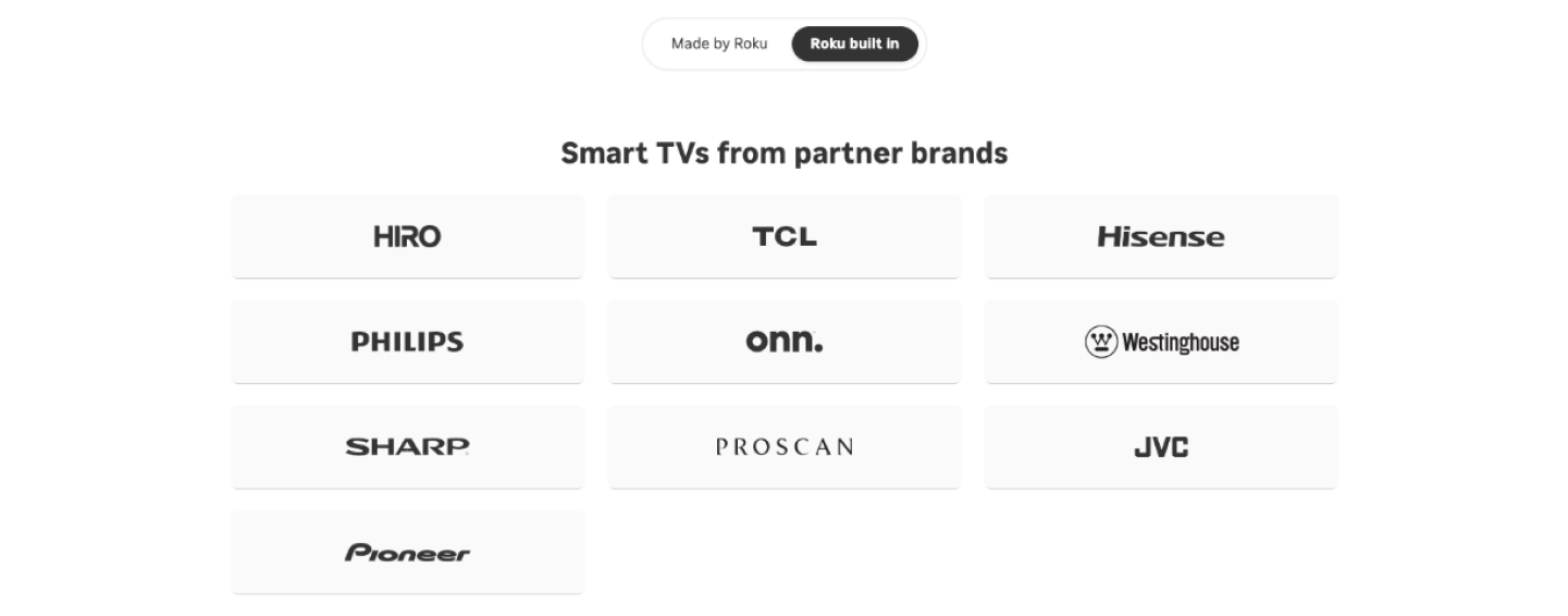
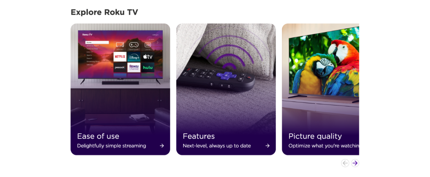
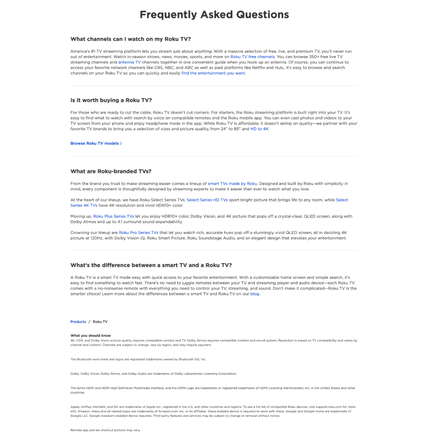

Notes: Before initiating the redesign, I conducted a focused UX audit to identify friction across hierarchy, conversion flow, and content density. The hero lacked a clear focal point and strong CTA prioritization, with navigation competing for attention. Product category cards showed inconsistent hierarchy and redundant action patterns, while the partner grid created unnecessary visual density without clear prioritization. Feature sections missed opportunities for progressive disclosure and interactive feedback, and the FAQ presented dense static content that increased cognitive load. These findings informed a redesign centered on clarity, scalability, engagement, and stronger conversion emphasis.
After
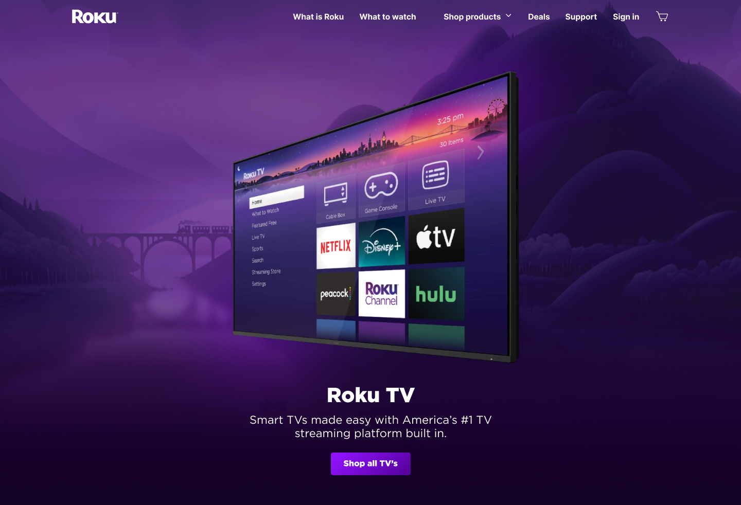


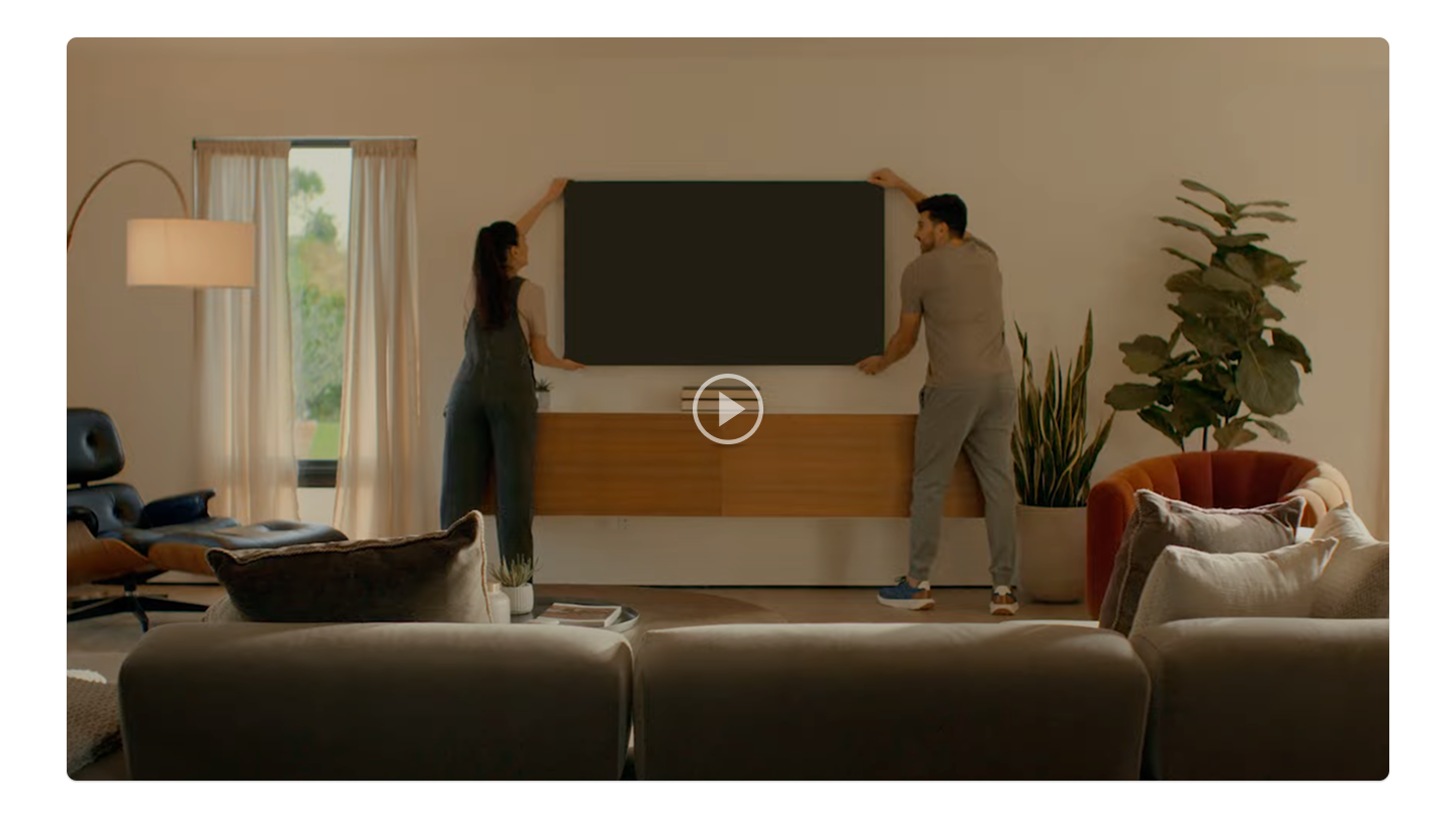
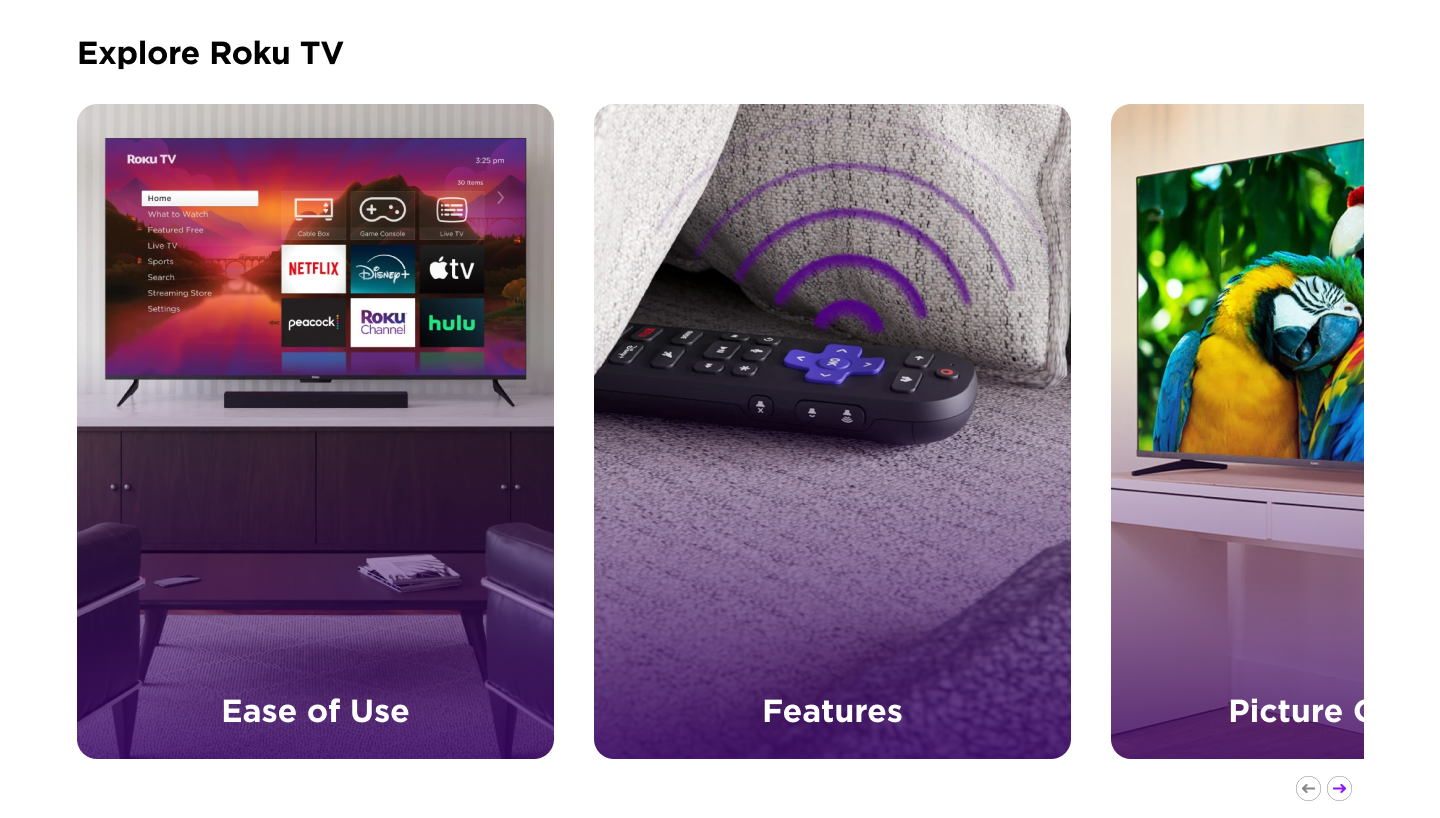
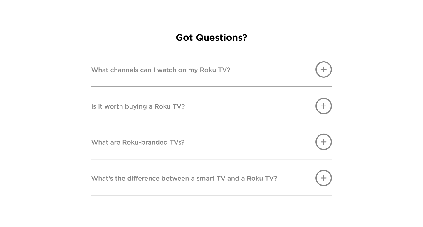
The redesign focused on clarifying hierarchy, reducing cognitive friction, and strengthening conversion signals while maintaining Roku’s brand language. I rebalanced the hero to create a clear focal point and stronger CTA prominence, standardized product card hierarchy to improve scannability, and condensed the partner grid to reduce visual density. A centralized promotional video was introduced to create a narrative midpoint in the page flow, while feature cards were refined with clearer copy structure and subtle micro-interactions to increase engagement. The FAQ was converted into accordion-based progressive disclosure to minimize cognitive load and maintain a clean, lightweight layout.
The redesigned desktop experience prioritizes visual hierarchy, structured content flow, and stronger conversion emphasis while maintaining brand consistency across sections.
Full interactive prototype available in Figma → Prototype link
The layout was designed mobile-first, prioritizing progressive disclosure and simplified hierarchy to reduce cognitive load on smaller screens.

The Business Problem
As Roku expanded its TV lineup across Plus, Pro, and Select series within an increasingly competitive smart TV market, the landing experience needed to better differentiate product tiers, clarify value propositions, and guide users toward confident purchase decisions. The redesign focused on strengthening hierarchy, improving feature discoverability, and creating a clearer conversion pathway aligned with business growth.
My Role
Led end-to-end redesign concept including competitive analysis, UX audit, and information architecture refinement. Defined interaction patterns and high-fidelity prototypes while aligning visual execution with Roku’s brand system. Presented strategic rationale and design iterations to stakeholders for feedback and refinement.
Strategy & Research
I conducted a structured audit of the existing experience to identify hierarchy breakdowns, weak conversion signals, and inconsistencies in product differentiation. From there, I mapped primary user intents — learning features, comparing models, and moving toward purchase — and restructured the information architecture to better support decision progression. Interaction patterns were intentionally subtle, reinforcing clarity and flow without adding unnecessary cognitive load.
Execution Highlights
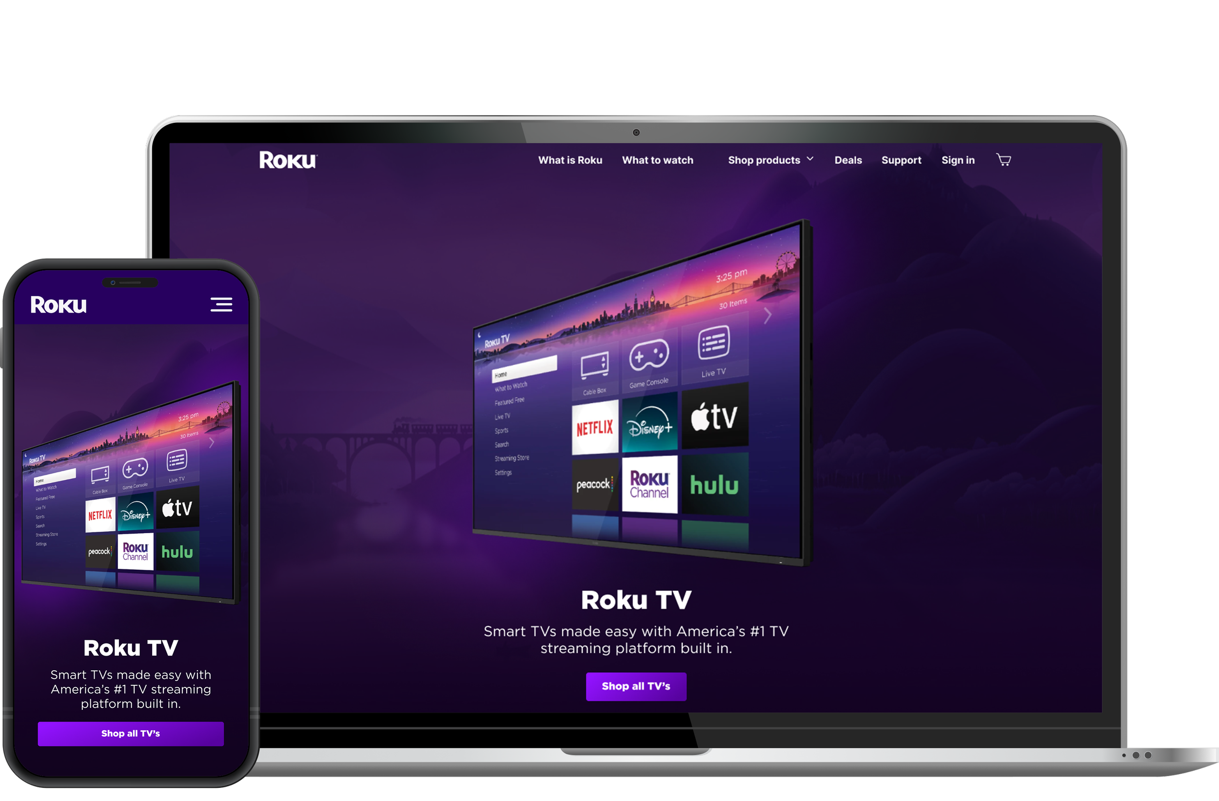
Info Architecture
Reorganized hero to clearly communicate value
Introduced progressive disclosure to reduce cognitive load
Interaction Enhancements
Added subtle motion to draw attention to key CTAs
States and transitions that improve comprehension
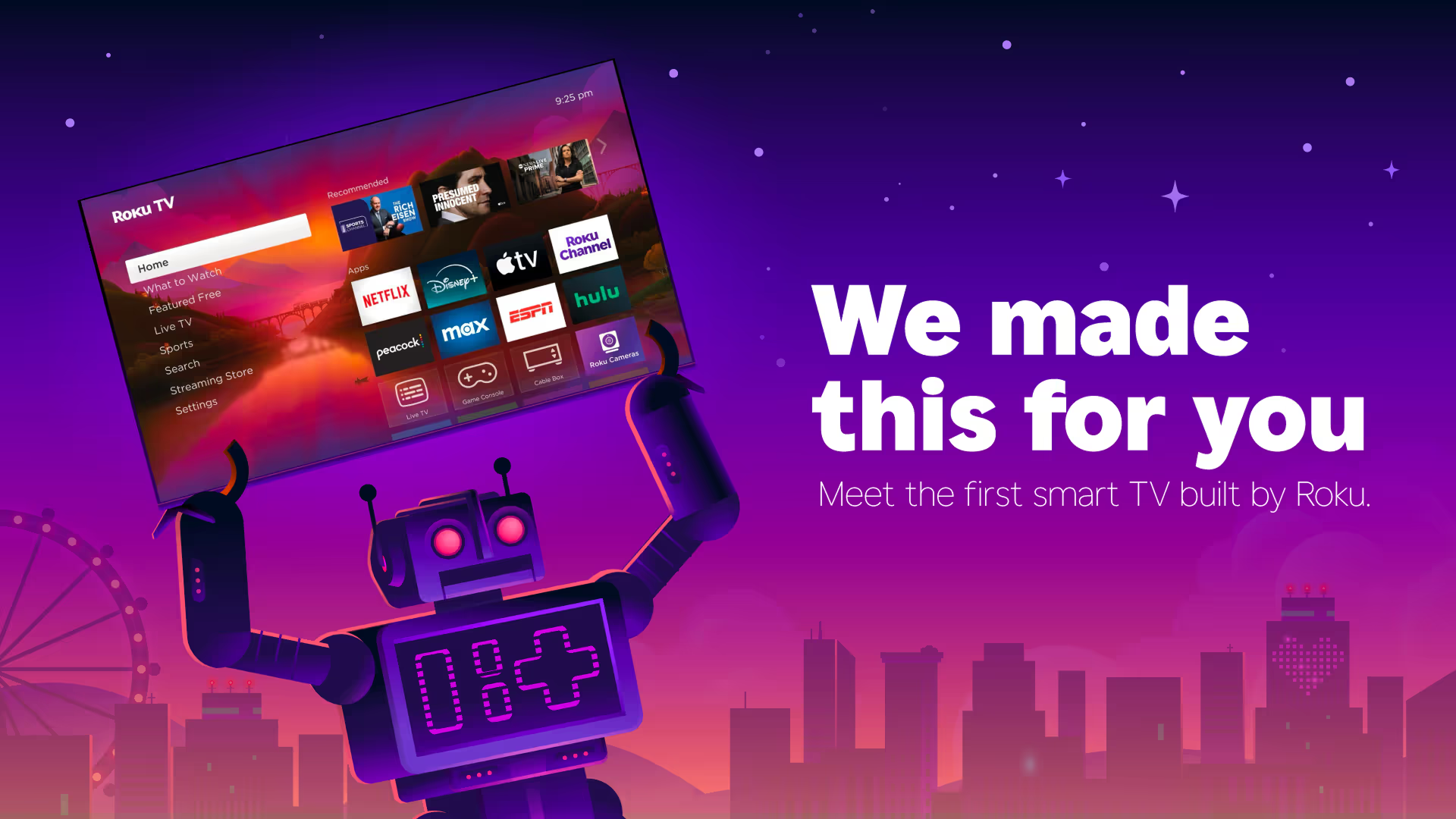
Alignment to Brand
Chrome, typography, and visual rhythm aligned with Roku guidelines
Interaction & Micro-Interactions
I introduced subtle hover states to reinforce affordance and improve scalability across product cards. Motion timing was kept minimal to align with Roku’s restrained brand tone and avoid distraction.
My Role
I led the UX/UI exploration for the concept, beginning with an audit of the existing Roku TV experience and competitive research across other consumer electronics brands. I used those findings to rethink the information hierarchy, product comparison experience, and responsive customer journey, then developed the concept through wireframes, high-fidelity UI, and interactive prototypes in Figma.
Impact
Based on prototype testing, the redesigned homepage increased CTA prominence and predicted engagement by 15–30% — based on heuristic review and benchmarking against competitor landing pages.