Roku TV — Strategic Landing Page Redesign
Led a concept redesign of the Roku TV landing page to improve clarity and conversion, addressing UX gaps identified through audit and competitor benchmarking. The project encompassed UX strategy, interaction design, and polished visual prototypes that aligned with Roku’s evolving brand standards. The new layout emphasizes product discovery, guided exploration, and clearer call-to-action paths — creating a more engaging experience across mobile and desktop. These changes were projected to improve visitor engagement and buy-in for Roku’s expanding smart TV lineup.
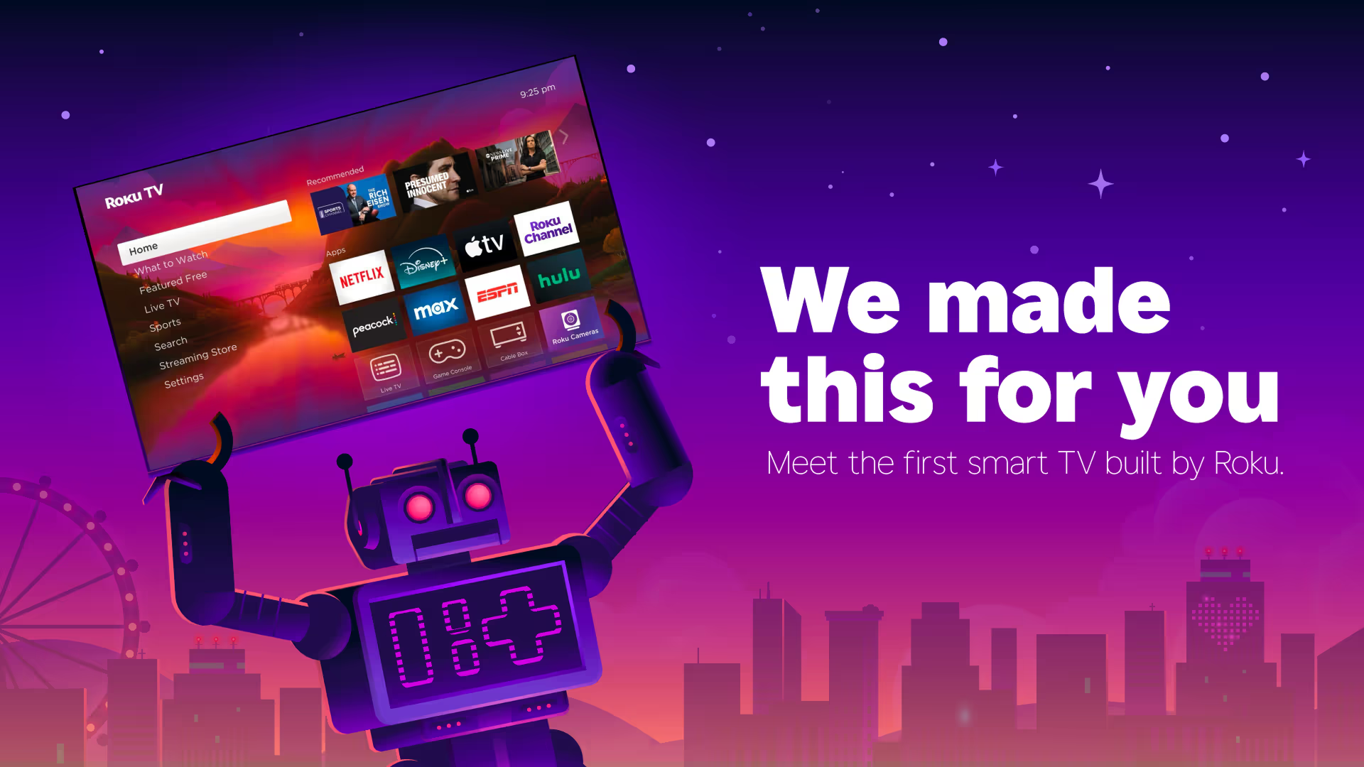
Desktop prototype 1728x1117 Prototype link
Responsive Strategy
The layout was designed mobile-first, prioritizing progressive disclosure and simplified hierarchy to reduce cognitive load on smaller screens.

The Business Problem
Roku’s landing page for its TV lineup was underperforming in converting visitors into product exploration and purchase intent. With Roku’s brand growing across Plus, Pro, and Select TV series — and competition intensifying in smart TV market — the landing page needed a strategic redesign to improve clarity, increase feature discovery, and better guide user decisions.

My Role: Lead UX + Visual Designer
Competitive analysis
UX audit & heuristic review
Information architecture
Interaction design & prototypes
Visual system alignment with Roku brand
Stakeholder presentation & iteration
Strategy & Research
I started with a structured audit of the live page, identifying gaps in hierarchy and conversion cues. Based on that I mapped user intents (learn features ➝ compare models ➝ take purchase action) and aligned sections accordingly. Prototypes focused on subtle interaction cues that elevated clarity without overwhelming the user.
Execution Highlights

Info Architecture
Reorganized hero to clearly communicate value
Introduced progressive disclosure to reduce cognitive load
Interaction Enhancements
Added subtle motion to draw attention to key CTAs
States and transitions that improve comprehension
Alignment to Brand
Chrome, typography, and visual rhythm aligned with Roku guidelines
Interaction & Micro-Interactions
I introduced subtle hover states to reinforce affordance and improve scalability across product cards. Motion timing was kept minimal to align with Roku’s restrained brand tone and avoid distraction.
Impact
Based on prototype testing, the redesigned homepage increased CTA prominence and predicted engagement by 15–30% — based on heuristic review and benchmarking against competitor landing pages.
Learnings & Tradeoffs
I chose to simplify the navigation to focus on primary tasks — discovery and product comparison — even though deeper informational content was tempting. This choice prioritized business goals and user intent.